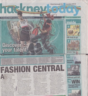
 The masthead of this newspaper "Hackney today" has been put in a Sans Serif font, the name "Hackney" has not been written with a capital at the beginning, which normally would be done as it the name of a place, giving a casual and less-informal impression. There is also a multi-coloured line intertwining through the text which is quite an eye catching effect. You can tell immediately there is a 3 colour scheme which has been used of blues. There is a date line directly under the masthead with also the issue number included. The main picture is of three young people, one dancing, one posing and looking away from the camera and the other crouched down, there's graphics art used as the background of the picture and also been edited on top of the images of the people as well. This would most likely appeal more towards a younger audience rather than older. The main story "Fashion Central" would most likely also appeal more towards a younger audience than older. There is an index going along the right side of some of the main articles included in the Newspaper, most of the articles shown are covering various subjects such as "artists eye" and "200 days to go" with an image of a basketball game, there is also an article on "Hackney history", which would probably appeal more towards an older audience, showing that the newspaper is trying to aim at all ages. There is an advertisement at the end of the page for Hackney Volunteers, which is mainly aiming towards a younger audience, especially as the image included in the advertisement is of 3 young people.
Wednesday, 26 September 2012
Hackney Today Review
 The masthead of this newspaper "Hackney today" has been put in a Sans Serif font, the name "Hackney" has not been written with a capital at the beginning, which normally would be done as it the name of a place, giving a casual and less-informal impression. There is also a multi-coloured line intertwining through the text which is quite an eye catching effect. You can tell immediately there is a 3 colour scheme which has been used of blues. There is a date line directly under the masthead with also the issue number included. The main picture is of three young people, one dancing, one posing and looking away from the camera and the other crouched down, there's graphics art used as the background of the picture and also been edited on top of the images of the people as well. This would most likely appeal more towards a younger audience rather than older. The main story "Fashion Central" would most likely also appeal more towards a younger audience than older. There is an index going along the right side of some of the main articles included in the Newspaper, most of the articles shown are covering various subjects such as "artists eye" and "200 days to go" with an image of a basketball game, there is also an article on "Hackney history", which would probably appeal more towards an older audience, showing that the newspaper is trying to aim at all ages. There is an advertisement at the end of the page for Hackney Volunteers, which is mainly aiming towards a younger audience, especially as the image included in the advertisement is of 3 young people.
Subscribe to:
Post Comments (Atom)
No comments:
Post a Comment