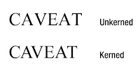
 Kerning is when you adjust the space between certain characters in a line of text. Without kerning, several letter combinations e.g WA and VA, can look awkward. Kerning is important in italic types, and as the size of the font increases. These smaller, precise adjustments may be used to tweak a specific word, such as in a logo design, or a large headline of a story in a newspaper.
Letter Spacing, also known as tracking, is the amount of space between a group of letters to affect density in a line or block of text. Letter-spacing adjustments are frequently used in news design. The speed with which pages must be completely by a deadline does not usually leave time to rewrite paragraphs that end in split words. Letter-spacing is increased or decreased by modest and usually unnoticeable amounts to fix these unattractive situations.
After researching the importance of kerning and letter-spacing, i think i will use them both in my newspaper for headlines and the masthead as it makes words easier to read and also doesn't give the impression of words being cramped.

No comments:
Post a Comment